Two Home Screens can use the same wallpaper and the same widgets, and one will look put-together while the other looks like a pile of apps. The difference is never the individual pieces — it’s whether they were chosen to agree with each other. Five principles get you most of the way there.
1. One dominant colour
Pick the single colour that will show up most — in the wallpaper, in widget surfaces, in app icon tints where iOS allows it — and let everything else be a supporting note. A Home Screen built around Midnight’s deep indigo reads as intentional the moment you stop asking “does the green weather icon clash with this” — because there’s no green icon answering back.
2. One accent, not four
An accent is the colour that’s allowed to stand out — a checkmark, a progress ring, a highlighted number. The mistake is letting every widget pick its own: a red streak counter next to a green step ring next to a blue clock face reads as noise even if each widget is well-designed in isolation.
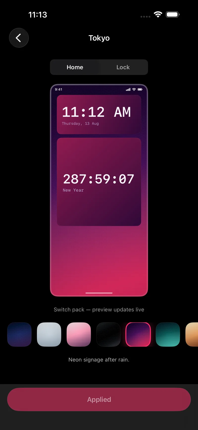
A theme pack solves this by definition — Tokyo’s single hot pink, Ocean’s single teal — because every widget in the pack draws its accent from the same source rather than picking its own.
3. Contrast is the actual job
A widget’s real job is staying readable against whatever’s behind it, in light and dark, at a glance and from an arm’s length. Low-detail wallpapers with one dominant colour make this easy; busy photos fight every widget placed on top of them, which is why the aesthetic Home Screens you’re copying rarely use one.
4. Match the surfaces, not just the colours
Two widgets can share a hex code and still look mismatched if one has a frosted-glass surface and the other a flat fill. This is the part a hand-picked wallpaper can’t solve on its own — it governs the wallpaper’s colours but not what a widget container is actually made of. A theme pack fixes both at once, because the surface treatment is part of the pack, not an accident of which widget app you happened to install.
5. Let type stay consistent
Every third-party widget brings its own font by default, which is the fastest way to make a Home Screen look assembled rather than designed. Widgets that share one type system — the same weight, the same numeral style — read as a single interface even before the colours are considered.
The restraint test
Before adding one more widget, ask whether it’s earning space or filling it. A Home Screen with three widgets that all agree with each other beats one with seven that don’t — restraint is the cheapest design skill there is, and it’s the one most screens are missing.
If a screen still looks busy after applying a single pack consistently, the fix is almost always removing a widget, not finding a different pack.
FAQ
Is "aesthetic" just a synonym for minimal?
No. Halloween and Aurora are both aesthetic and neither is minimal — the principles here are about internal consistency, not about how much is on screen.
What’s the fastest way to test if a Home Screen works?
Lock the phone, then unlock it and look at the Lock Screen and Home Screen back to back. If they read as two different apps’ idea of a good screen, the colours don’t match yet.
Do I need design experience to get this right?
No — the reason a theme pack works is that the colour decisions were already made by someone who does this for a living. Picking a pack and applying it consistently gets most of the way there without any design background.
Should widgets match the wallpaper exactly?
Close, not exact. A widget surface that’s identical to the wallpaper behind it loses its edge and becomes hard to read at a glance — a small contrast step between the two is what keeps a widget legible without breaking the palette.