A “Home Screen idea” that’s really just a wallpaper is half an idea — the widgets have to match it, or the second you unlock your phone the illusion is gone. Every look below is a pack, not a picture: apply it and the wallpaper, the widget surfaces and the type all move together.
Minimal & quiet
The look that ages best. One or two widgets, a lot of empty space, text doing the work instead of colour.
- 01Minimal — the pack this whole category is named after: pale surfaces, one accent, nothing competing with the clock.
- 02Light — the same restraint in daylight colours, for anyone who finds dark packs heavy in the morning.
- 03Linen — a warm off-white surface with visible texture, closer to paper than glass.
- 04Nordic — cool greys and one muted blue, the pack most often paired with a single large Clock widget and nothing else above the fold.
Dark & moody
Better battery life on an OLED display, and a Lock Screen that doesn’t flash you at 2am.
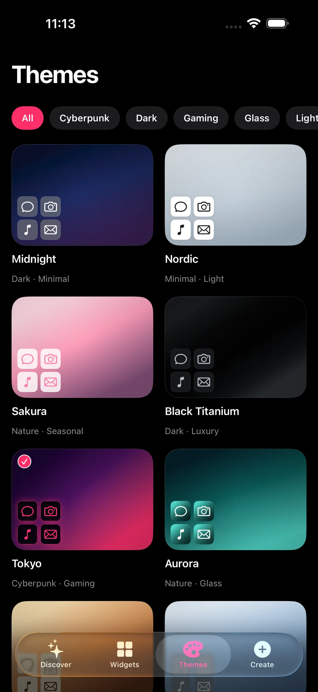
- 05Dark — true black, ink-flat surfaces, quiet contrast. The pack built around darkness itself rather than a dark colour.
- 06Black Titanium — machined greys on true black, the closest pack to the actual finish on a Pro-model iPhone.
- 07Midnight — deep indigo with glass-surfaced widgets. The pack most Novique users apply first.
- 08Space — deep field violet with starlight accents in the gradient, not a photo of a nebula.
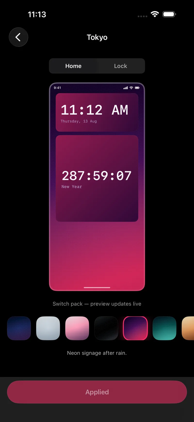
- 09Tokyo — neon signage after rain: dark purple opening into bright magenta-pink, the highest-contrast pack in the dark group.
Material & tactile
Surfaces named after what they look like they’re made of, rather than a colour name.
- 10Carrara — cool stone, veined and quiet: a near-white gradient close enough to Marble that it’s worth comparing both before picking one.
- 11Marble — cold stone with grey veins, still light. The cooler of the two stone packs rather than a darker one.
- 12Machined — turned metal under a low sheen, closer to brushed steel than either stone pack.
- 13Glasshouse — frosted panes over a pale sky, built around the same translucent surface Novique’s glass widget style uses.
- 14Blueprint — dark navy opening into bright blue, ruled lines and a drafting-table glow. One of the ten free packs.
- 15Cartograph — the same contour-line idea in green rather than blue, like a topographic map instead of a technical drawing.
Nature & atmosphere
Landscape-inspired gradients rather than landscape photos, so they still read clearly behind widget text.
- 16Nature — greens through a soft gradient, the calmest pack in the catalogue.
- 17Forest — darker, denser greens with more contrast against widget text.
- 18Ocean — open water, from pale shallows to deep teal-blue — a genuine gradient rather than one flat colour.
- 19Desert — warm sand and rust tones, one of the few packs that reads warm rather than cool.
- 20Aurora — deep teal opening into bright cyan-green, cold light bending over the pole rather than a literal night sky.
- 21Nebula — near-black opening into violet and pale lavender, more abstract and less green than Aurora.
Seasonal
The one category worth actually rotating. Four packs built for a specific time of year rather than a permanent look.
- 22Autumn — amber and rust, the pack most people switch to in October.
- 23Winter — cool whites and pale blue, close to Nordic but colder.
- 24Christmas — pine green opening into cranberry red, with a candlelit red accent rather than gold. Built to leave on for about four weeks a year.
- 25Halloween — pumpkin-orange light in a violet dark, not literal black. The pack with the most character of any in the catalogue.
Playful & bright
Not counted in the 25 above, but worth knowing about: Crayon Box — primary colours, drawn with a heavy hand, and free — Bubblegum — sweet pink cooled by mint — Cel Shade — a flat, hard-edged sunset — and Summer Sky — blue overhead, warm at the horizon. Four high-saturation packs built for a brighter look than anything in the other groups.
FAQ
Do I need Novique Pro to try most of these?
No. Ten packs are free forever — Blueprint, Cartograph, Cascade, Crayon Box, Dark, Light, Linen, Midnight, Minimal and Nordic — which covers the minimal, dark and material categories below in full. The seasonal and nature packs are part of Pro.
Can I preview a pack before committing to it?
Yes. Novique’s theme detail screen shows a live Home Screen and Lock Screen mock for the pack you’re viewing, and nothing changes on your actual device until you tap Apply.
Do these looks work on iPad too?
Yes — every pack applies the same way on iPhone, iPad and Mac. The iPad gallery adds a live inspector so you can tune size and accent next to the widget instead of guessing and backing out.
What if I want to keep my own photo instead of a pack’s wallpaper?
Photo Frame (a Pro family) puts your own picture behind any widget, framed and dimmed per size, so you can mix a pack’s widget colours with a personal photo instead of the pack’s own gradient.